FLIGHT CENTRE GROUP
Manager, creative direction, branding, illustration & digital creative
This international travel company is fast-paced, and agile and creates brands and products continuously adapting to the market. My work as the design manager ranged from creating new brands, concepts, campaigns, and websites to the implementation, maintenance, and management of these. My team was an even split of UI, UX, web, and graphic designers at various levels, from entry to assistant manager. To ensure my team's full engagement and continuous growth, I encouraged inter-departmental learning to spread and balance skills that may be lacking. This in turn increased the quality of the teams' support of the wider business. Located within the marketing department, we had the lowest staff attrition rate and the happiest team after doing 360-degree anonymous feedback, scoring 93% against an average of 67%.
Upgrade magazine
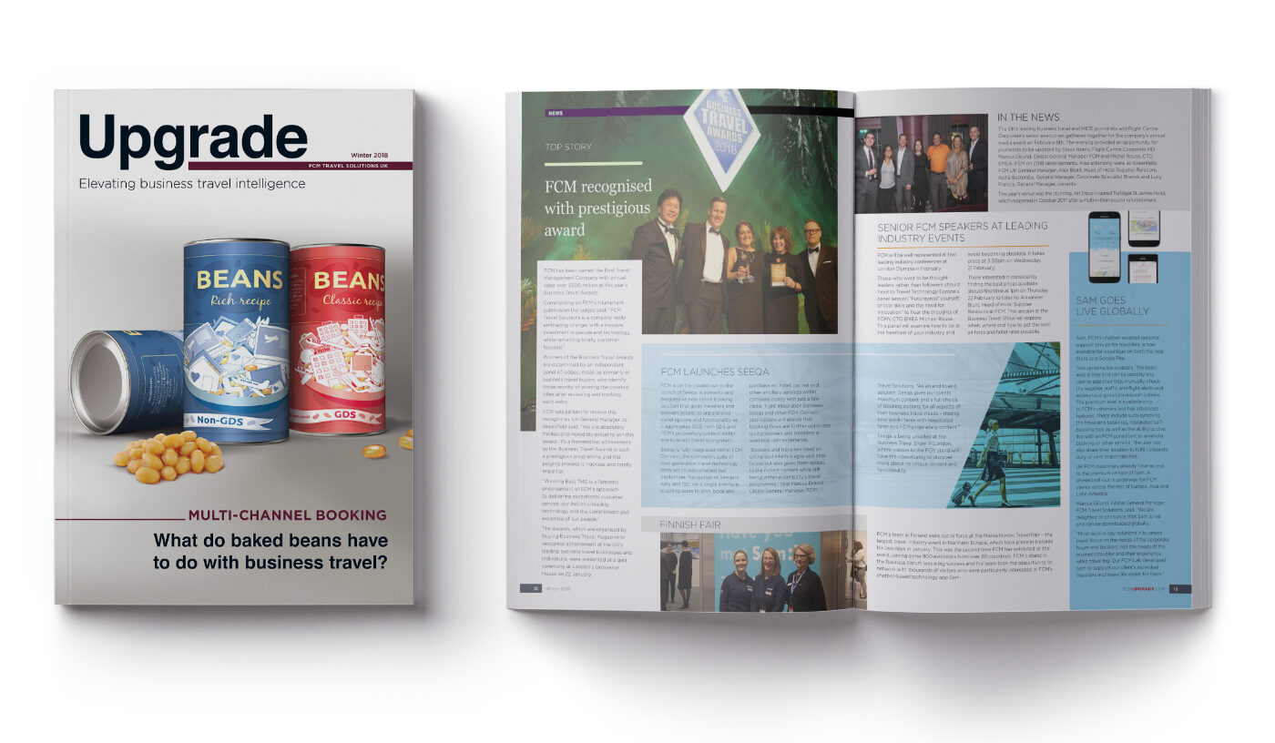
FCM publishes a quarterly magazine for key travel bookers and global travel managers across their prospect database. I was approached to create the magazine from scratch, as it was a brand new concept. Initially, I was in charge of conceptualisation, illustration, design, layout, and creative direction. Once the design was approved, my talented team took over creating the templates and doing the artwork required for each publication. During the magazine's quarterly production, I continued to be responsible for the quality, end production, and management, ensuring the magazine was delivered as expected—never forgetting the importance of good communication across the teams.
Photo manipulation
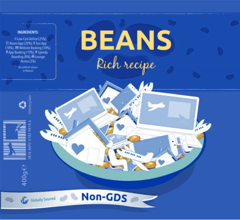
Below is the step-by-step development of the cover I created for the FCM Upgrade magazine. This was done from scratch which include illustration, photo manipulation and design. The end result is this uniquely memorable, eye-catching cover.

Rebranding roll out
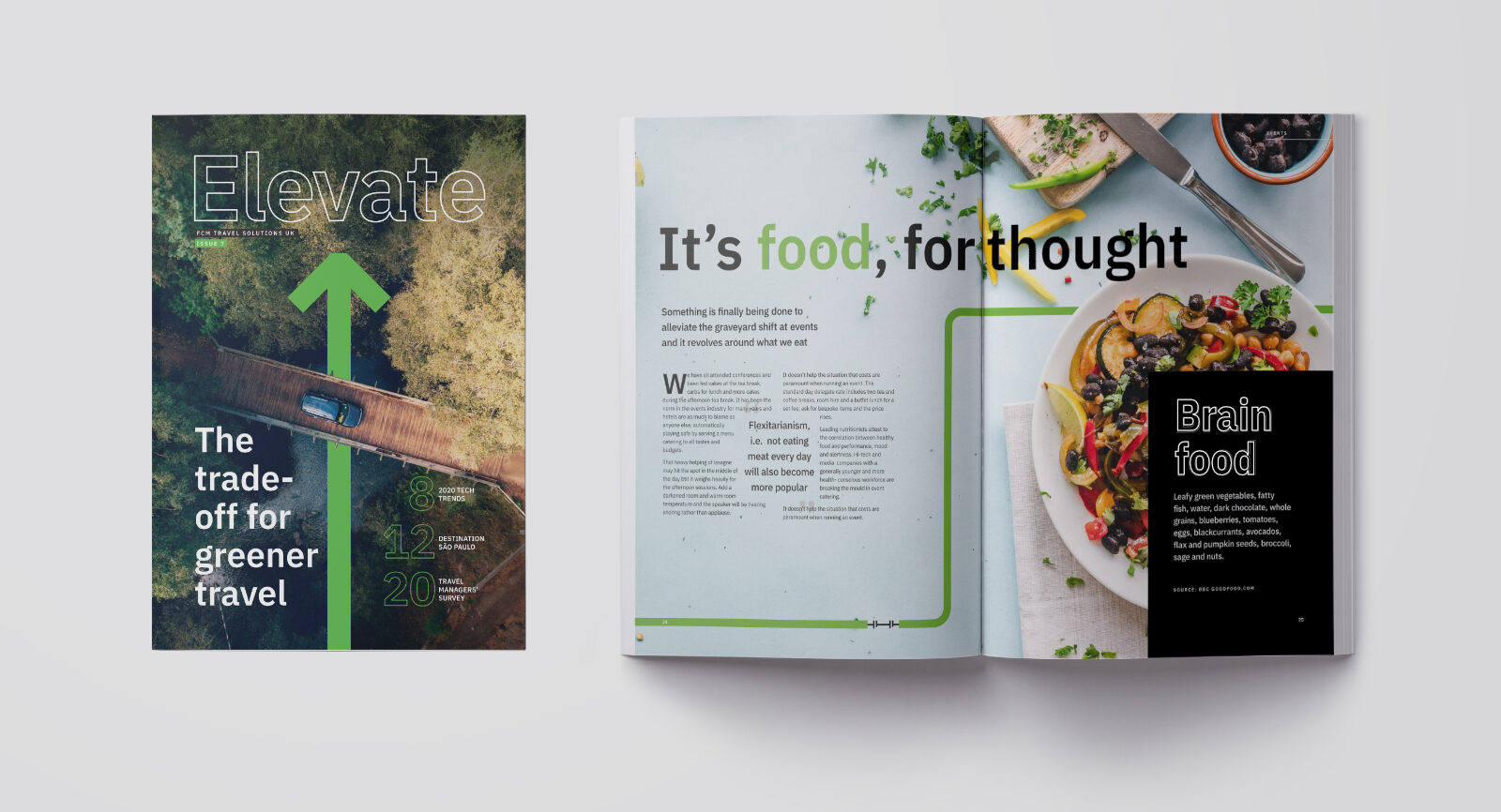
In 2020, the start of a new brand for FCM Travel Solutions was rolled out. To ensure a neutral decision across the international company, an external agency was brought on to create the logo. Thereafter, I took the brand and created the brand around it, sharing it with the rest of the world.
FCM has a broad set of print and digital artwork. My task was to take all these pieces and rebrand them, with the help of my team we got through 27 different pieces of various design work within three months. This included rebranding the magazine to reflect a fresh new look and feel, cover-to-cover.
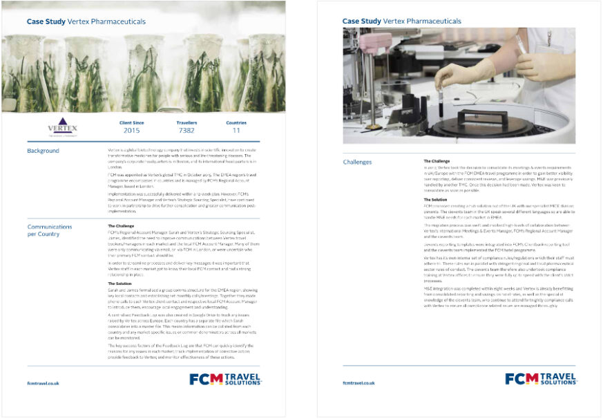
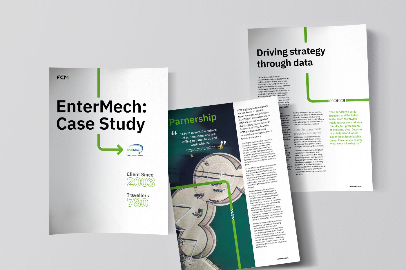
This case study is an example of a smaller piece that I rebranded. There were many challenges. Firstly, the new brand format needed to be very different from the existing brand. Secondly, the update would have to be done country-wide. Thirdly, the teams were under time pressure to make these amends.
The solution was to produce a very clear template complete with master pages, font styles, paragraph styles, and colour palettes. This resulted in consistent, time-efficient, accurate, and on-brand artwork delivered by the design team no matter where in the world it was produced.
Animation and corporate deliverables
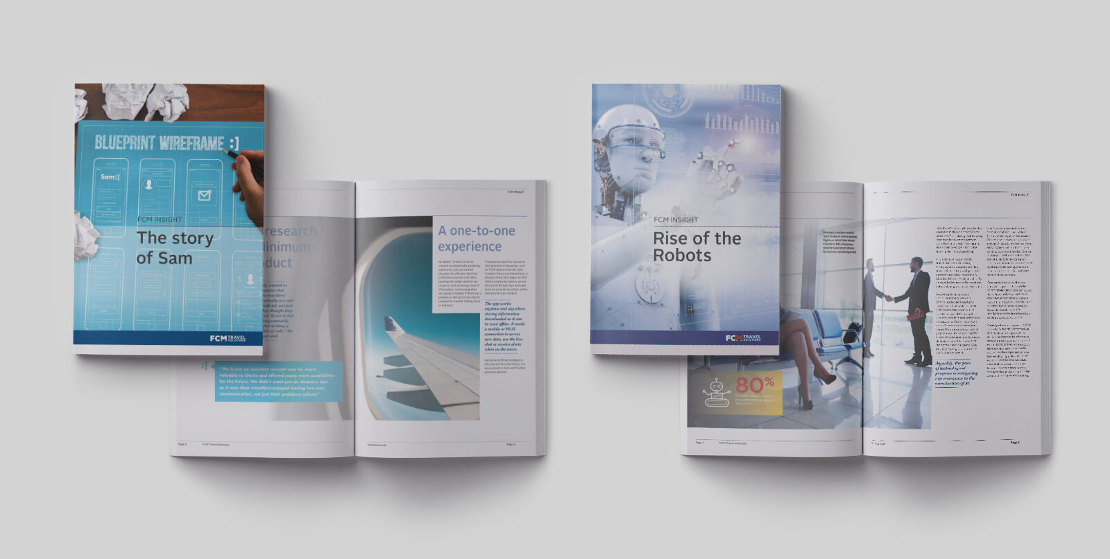
Of the many FCM sub-brands, here is an example of one called Sam. This brand regularly required animated videos. These were done in After Effects. Sticking to the branding and voice was all important. Sam also required adverts, brochures, case studies, corporate event deliverables and stand designs - to mention a few. I managed, designed and coordinated these on a month-by-month basis as Sam fits within FCM in some cases they were put together in one piece.
Brand development and maintenance
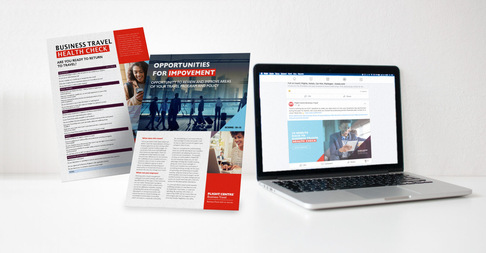
Flight Centre Business Travel and Corporate Traveller are the SME business travel brands of the Flight Centre Group. My responsibility as manager of the creative and digital team was to create, champion, and refine the brand guidelines. On a weekly basis, I, with the support of my team, delivered digital and printed handouts, newsletters, and internal and external communication pieces. From concept to delivery, I worked closely with the marketing team, directors, and, in some cases, the managing director across multiple countries.


Sub-branding
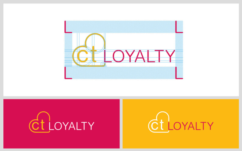
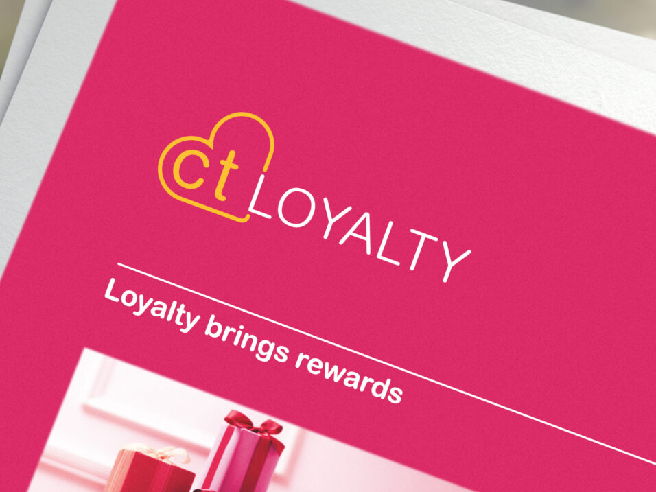
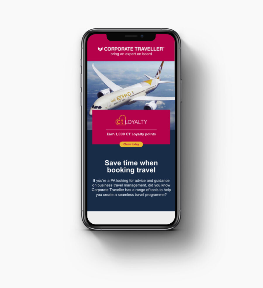
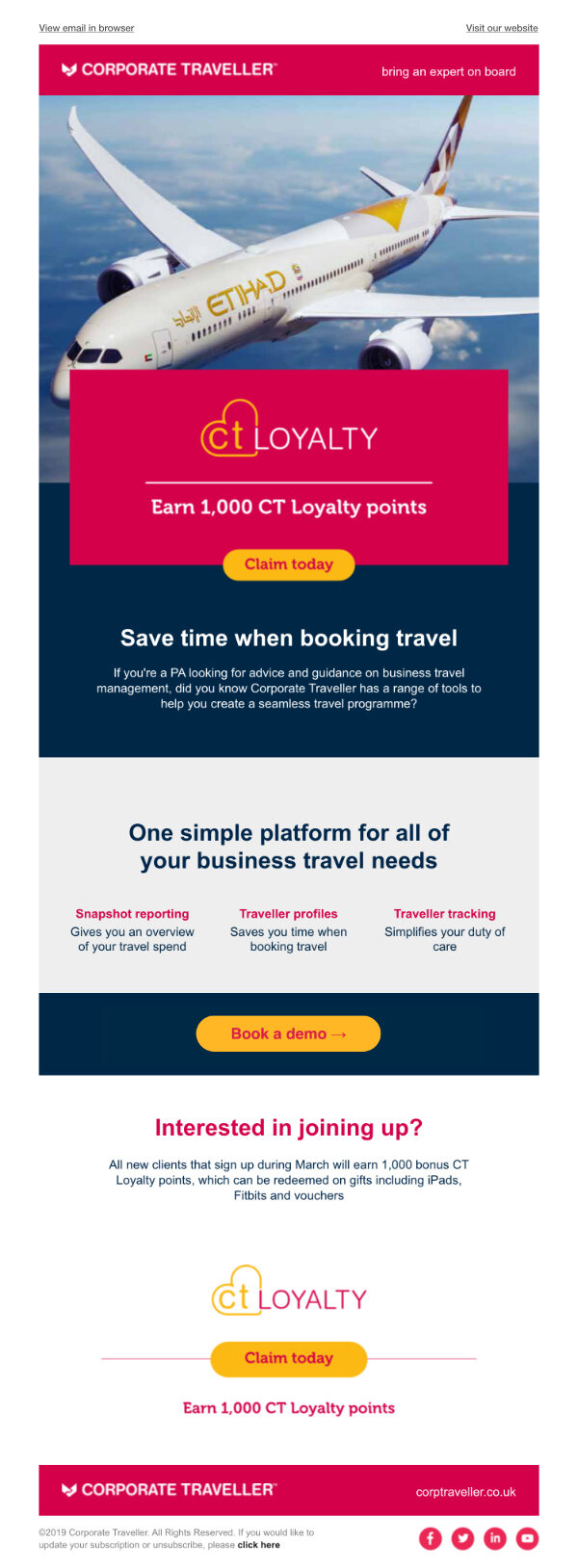
Many of the brands within the Flight Centre Group have sub-brands, with their own customer expectations and personalities that are different from the parent brand. In a few cases, they require a brand identity of their own (as seen on the FCM sub-brand Sam higher up on this page), while others need to sit comfortably within the brand. CTloyalty is an example of this.
I created this CTloyalty from scratch. In order for it to fit within the Corporate Traveller branding, I used the same font while adapting it for legibility and weighting. The brief was for the brand to be emotive and graphic and is aimed at personal assistants who book their SME company travel. Beyond the brand, I designed the newsletters, handouts, event stands, and digital and printed ads.
New brand development
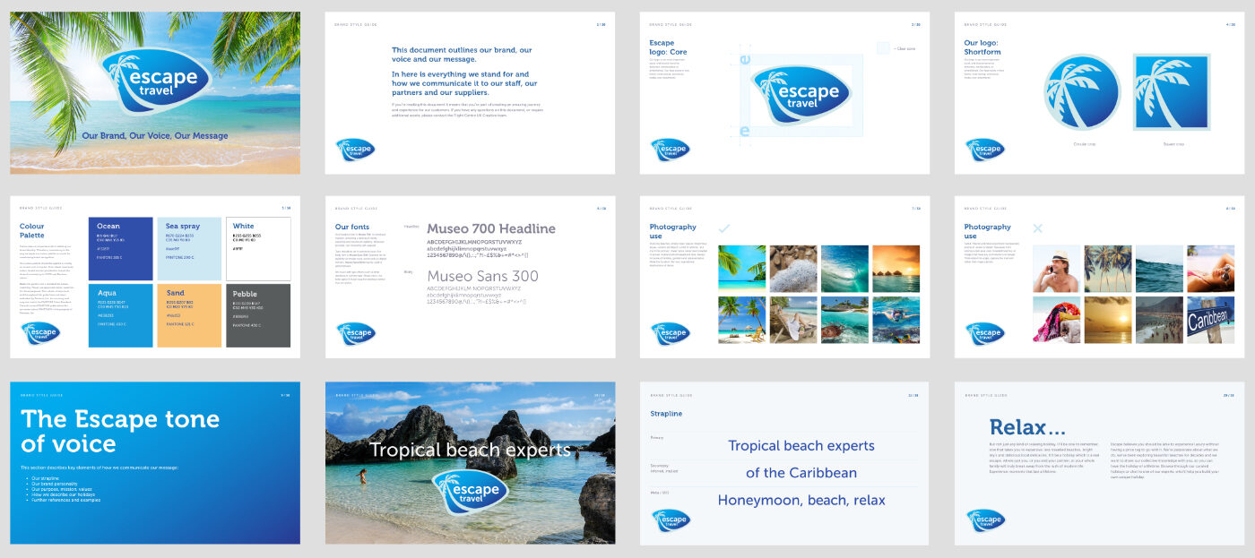
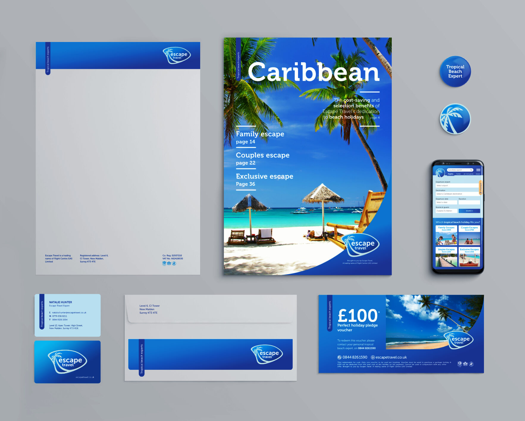
The Flight Centre Group is constantly looking to add, adjust, and improve their products, putting the client first at every turn. One strategy is using focused brands to attract the right customers. It became clear that there was a niche market for tropical holidays, aimed at couples, families, singles, and those wanting an exclusive experience.
I created a brand with a Caribbean and Mediterranean island feel, using curves to represent the organic lapping of the ocean against the land. When creating the brand guidelines, I kept the colour palette monochromatic with a pop of orange for those moments where highlighting is required.
Some examples of the work I produced are below. Of course, with a business of this size, there are many deliverables that are not portfolio worthy.
