DIY SKILLS ACADEMY
Branding, creative direction, strategy, UX, UI, A/B testing & digital
DIY Skills Academy is an exciting start-up. When the owner of the new company approached me, he had all the makings of a fantastic business, but no brand, or clear strategy. I set out to create a business plan, which I then used as a springboard for the business story.
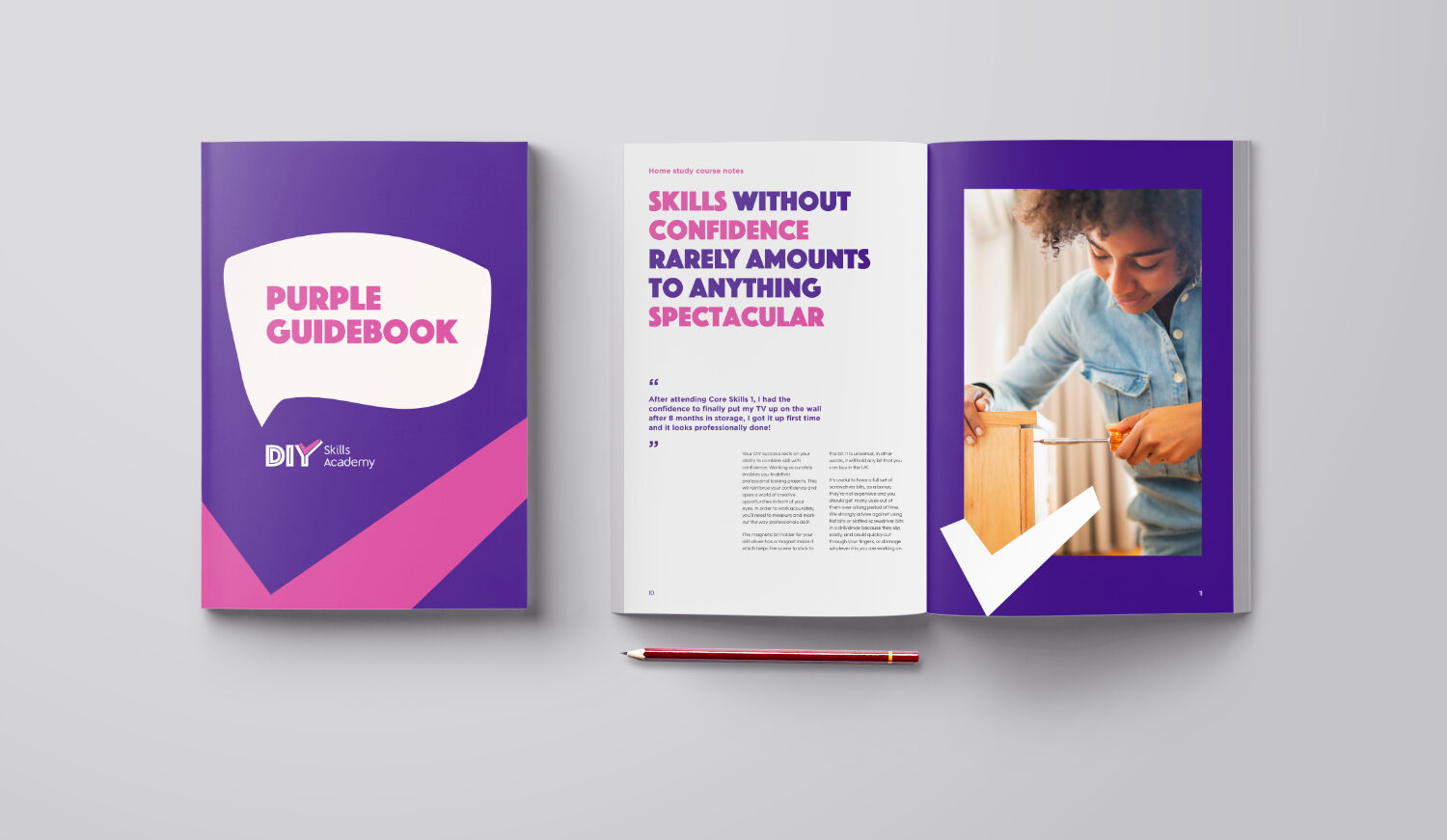
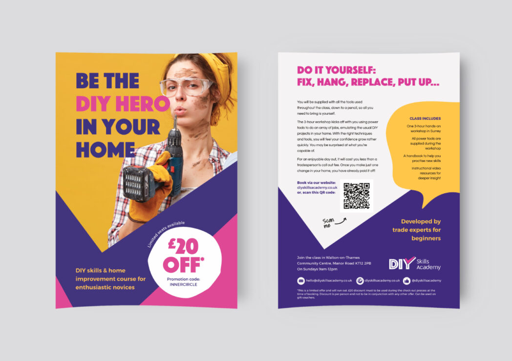
The DIY world has historically been skewed to the masculine side and seen as exclusively for strong, skilled, and trained tradesmen. My market research concluded that I would need to flip this on its head. I created a brand that is approachable, confidence-evoking, empowering, trusting, and professional with a light-hearted approach; talking about the personal side and not the trade/tool side.
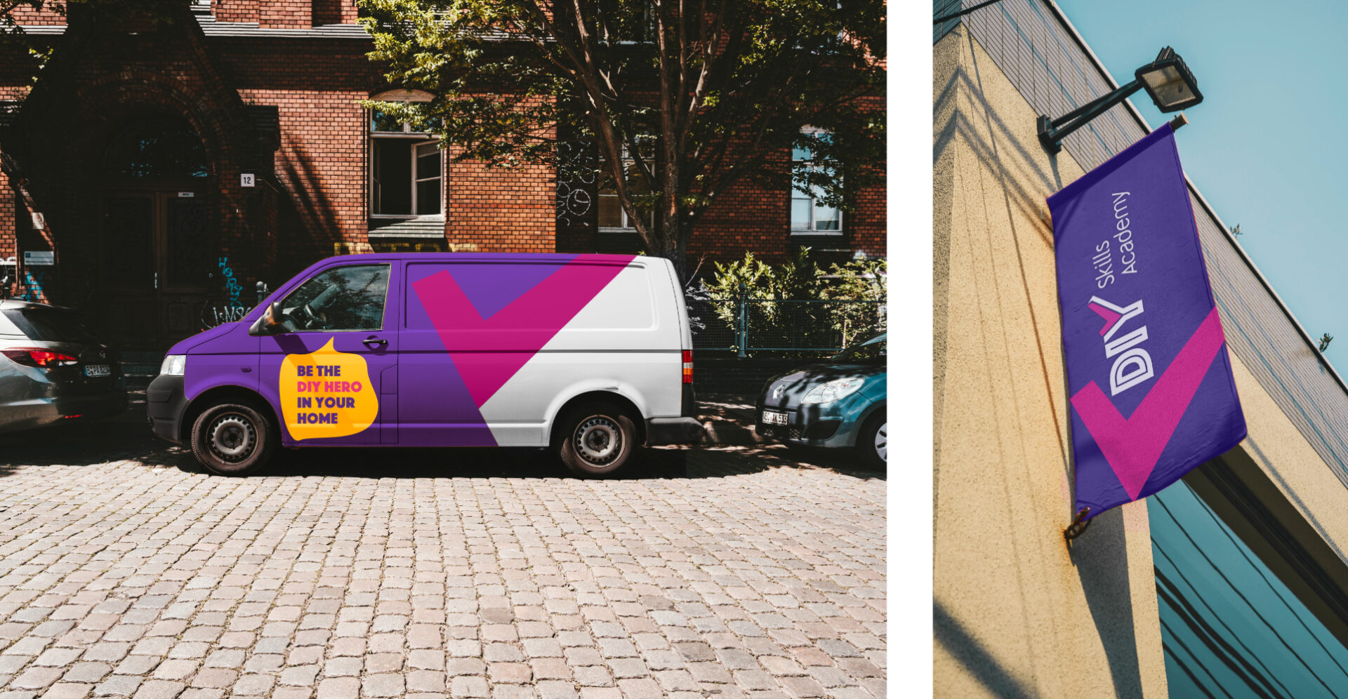
The belief is that just about everyone is able to carry out DIY. Positivity was all important with this brand, as most of the clients would be rather nervous about trying the course, which many would find daunting. I chose purple as it stands out boldly amongst competitors and gives the feeling of quality.
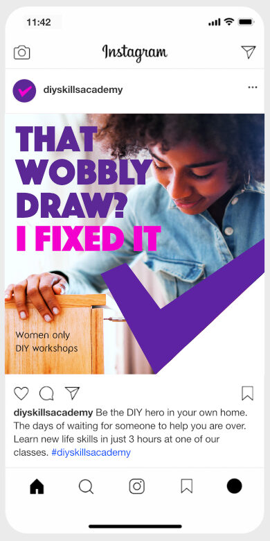
In order test the product in field conditions, I ran four soft launches. Holding several user interviews and questionnaires, shared mock scenarios, and ran A/B testing. Through my research, the customers were narrowed down to three main groups:
- Complete novices - mostly female
- Skill polishers - male with limited DIY skills
- Socialisers - due to lockdown and restrictions, they yearned for a fun day out
People lead busy lives. Therefore, the third group was the most responsive and the easiest to influence.
The design process followed a macro-structured timeline of projects that were mapped to 1-month release cycles directly with the company owner. This often involves initial storyboarding research. To reach multiple audiences and to be mindful of diversity equity and inclusion, I structured the communication in a non-discriminatory way. The brand is inclusive of all genders, physical strengths, abilities, and skill levels.
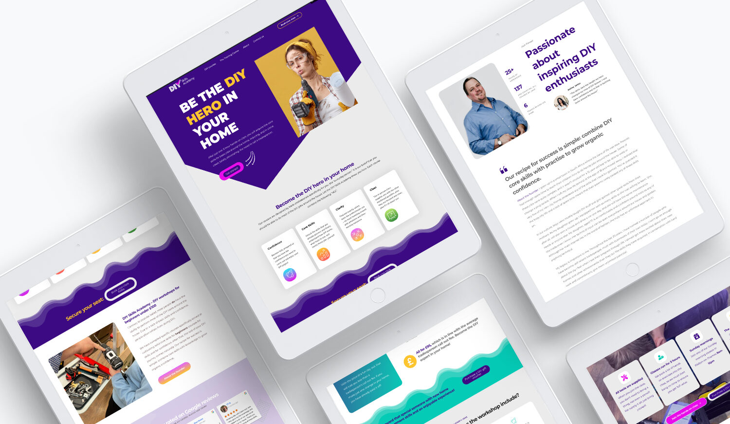
The analysis and discovery of the website included user experience testing, low fidelity wireframe creation, and implementation meetings, as well as a feature or page prioritisation. I then moved on to development and visual design.
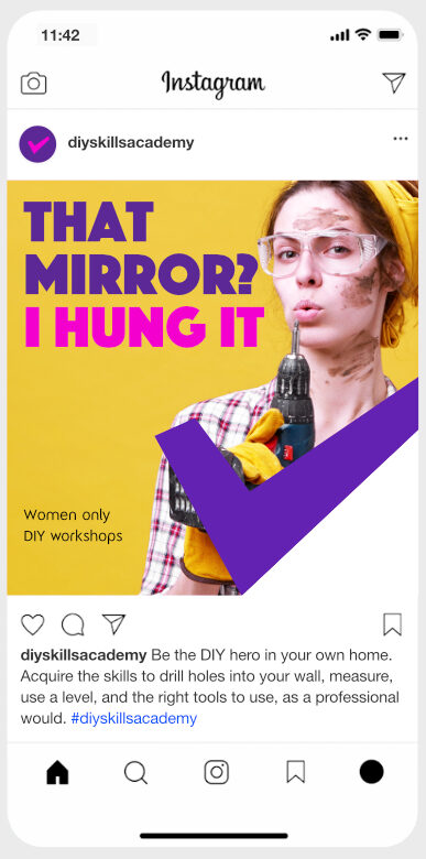
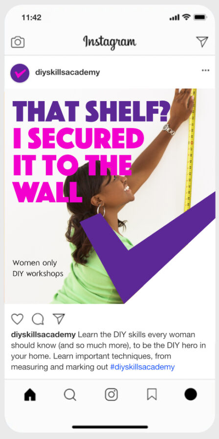
Once the prioritised web pages were completed, I was able to roll out the marketing campaigns which specifically targeted the three main customer types noted above.
I ran daily campaigns across social media platforms including Twitter, Facebook and paid campaigns on Google. Based on the leads generated via the targeted campaigns, I sent out follow-up newsletters which increased the web traffic resulting in drawing attention while building a client base for future campaigns.
